Custom page layout
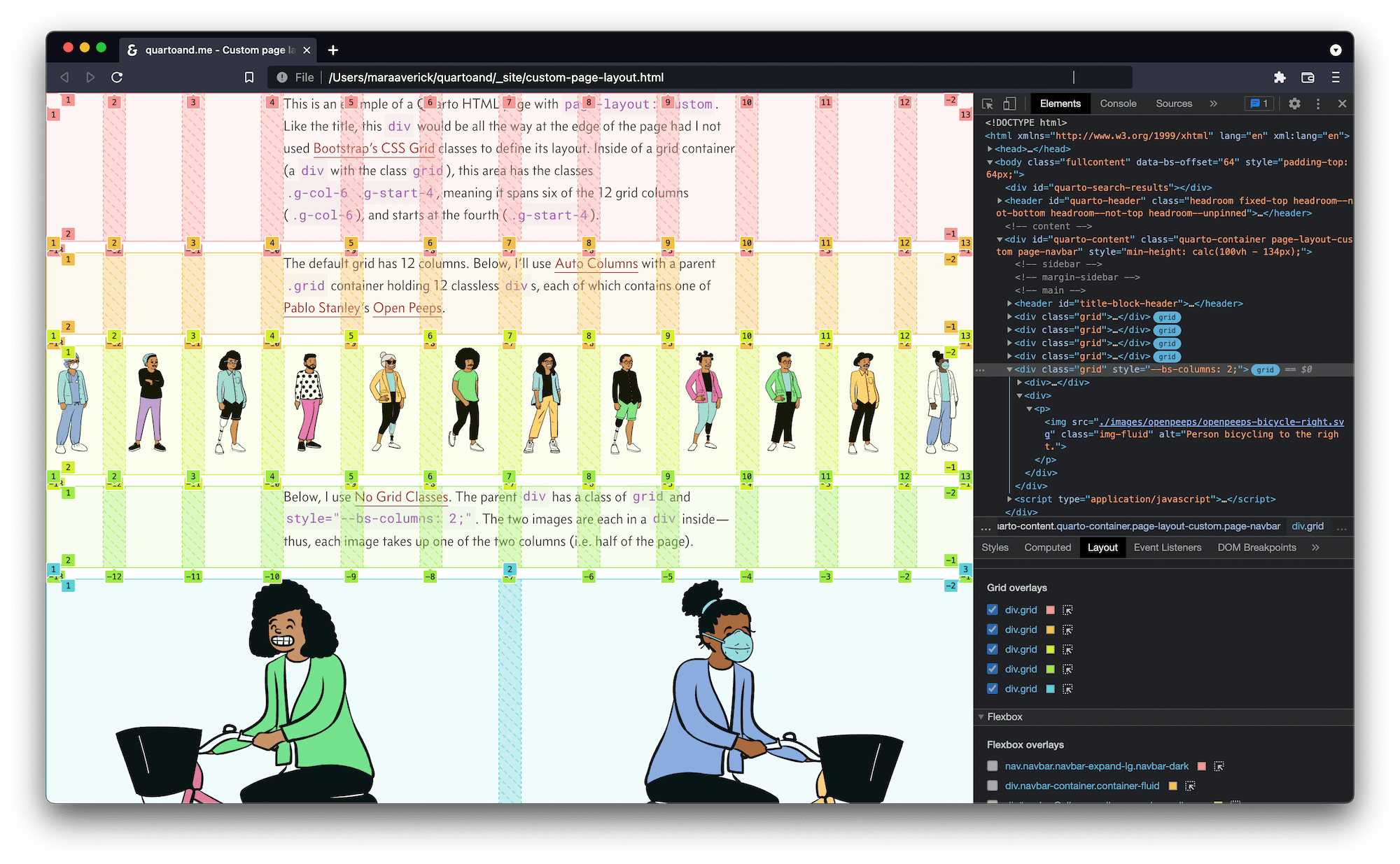
This is an example of a Quarto HTML page with page-layout: custom. Like the page title, this div would be all the way at the edge of the page had I not used Bootstrap’s CSS Grid classes to define its layout. Inside of a grid container (a div with the class grid), this area has the classes .g-col-6 .g-start-4, meaning it spans six of the 12 grid columns (.g-col-6), and starts at the fourth (.g-start-4).
The default grid has 12 columns. Below, I’ll use Auto Columns with a parent .grid container holding 12 classless divs, each of which contains one of Pablo Stanley’s Open Peeps.
Below, I use No Grid Classes. The parent div has a class of grid and style="--bs-columns: 2;". The two images are each in a div inside—thus, each image takes up one of the two columns (i.e. half of the page).
Here’s a screenshot of what the grids on this page look like using the browser’s CSS Grid Inspector. I’ve written more about CSS Grid and using in-browser inspector tools with it here. See my page-layout write-up for more on page-layout options in Quarto and links to the relevant documentation.


