- 2024-02-28 Support for Sass
@userule with the addition of the Quarto region decorator forscss:uses. - 2024-02-24 Update links to Bootstrap docs to version 5.3.
Preface
I am not a front-end engineer. Sure, I know how to hackily make a few adjustments to a CSS file—I’ve lived through enough web scraping to learn a little about selectors—but things like Gulp and Grunt just sound like Babel to me.1
What I do know about front-end development always comes as a result of falling down a rabbit hole. There’s something I want to customize, one link leads to another, and suddenly I’m trying to grok larger concepts that I won’t be putting to use on the regular—which is why I’m taking notes!
In this instance, I was reading up on Quarto (Allaire and Dervieux 2024), which led to docs on Quarto’s HTML Theming (and “More About Quarto Themes”), which somehow got me elbow-deep in the Sass lang documentation, trying to get a handle on how Bootswatch themes modify the underlying Bootstrap framework.

Before/if you proceed, keep these things in mind:
The aforementioned documentation is very good.
The target audience for these notes is mainly me.
These concepts are decidedly non-linear. (Bootswatch uses Sass files to customize Bootstrap, so who’s to say which part to learn first?)
I’m pretty sure you can do all of these things in Quarto without ever learning any of this.
Sass-i-ness
Sass (Lintorn-Catlin et al. 2021) bills itself as CSS with superpowers, and I’m inclined to believe it. Actually, some of these superpowers (namely “at-rules”) are built right into CSS these days.2
If you’ve read the Quarto-theme docs, you might be wondering why I’m going on about Sass when all of the files for customization end in .scss. Apparently Sass supports two syntaxes: SCSS (the files for which end in .scss), and “the indented syntax” (which uses the file extension .sass). Both .scss and .sass files are “Sass stylesheets”—so, just run with it.
Quarto themes are SCSS text files that use “decorators” (special comments) to denote the “type” (in a non-technical sense of the word) of SCSS thing going on in that area. The regions are: uses, functions, defaults, mixins, and rules, each of which gets a decorator that follows the format /*-- scss:TYPE --*/ (where TYPE is, e.g. functions, or rules).
Expand the code below to see an example of a Quarto theme with region decorators:
Show the code
SCSS
/*-- scss:functions --*/
@function colorToRGB ($color) {
  @return "rgb(" + red($color) + ", " + green($color) + ", " + blue($color)+ ")";
}

/*-- scss:defaults --*/
$h2-font-size:          1.6rem !default;
$headings-font-weight:  500 !default;
$body-color:            $gray-700 !default;

/*-- scss:rules --*/
h1, h2, h3, h4, h5, h6 {
  text-shadow: -1px -1px 0 rgba(0, 0, 0, .3);
}
You might not need a sass:uses region (which wasn’t a thing when I first wrote this post in January of 2022, so I used @import instead — they both let you load other “modules”/stylesheets). Sass requires that the @use rule must come before any other rules in the stylesheet, which is why this section of your theme has to come first. If you put @use elsewhere in your theme, it will error out with:
Terminal
# @use rules must be written before any other rules.The defaults section is made up of default values for Sass variables (not to be confused with CSS variables). You can tell you’re reading the name of a Sass variable if it starts with a $. You can tell a default is being set when the value ends in !default. Sass style rules are basically the same as CSS rulesets: elements are chosen with selectors, and then styled with property declarations (i.e. how elements that match the selector are styled).
Functions are defined with the @function at-rule, and take arguments (just like R functions). For example, Bootstrap has the following Sass functions, tint-color() and shade-color(), that lighten or darken colors by a given amount.
SCSS
// Tint a color: mix a color with white
@function tint-color($color, $weight) {
  @return mix(white, $color, $weight);
}

// Shade a color: mix a color with black
@function shade-color($color, $weight) {
  @return mix(black, $color, $weight);
}
I go into more detail about Sass mixins later on in these notes.
All this Sass stuff can work independent of Bootstrap innards. The Quarto Sass variables can be specified within an SCSS file.
Bootstrap
Bootstrap is a front-end open source “toolkit.” Lifting straight from the Quarto-theme docs here:
Bootstrap defines over 1,400 variables that control fonts, colors, padding, borders, and much more.
You can see the raw Bootstrap Sass variables in Bootstrap’s _variables.scss file.
Bootstrap can be used to design full-blown user interfaces. Since this is well beyond the scope of what I want to do, I use the Bootstrap docs in an ad hoc manner. If I find myself wanting to tinker with something—say, typography or text alignment—I go to the Bootstrap reference before I bother to implement something on my own. Chances are, they’ve already got it covered—actually, Quarto probably has its own user-friendly layer of abstraction over it, so maybe go to the Quarto docs then Bootstrap.
Bootswatch
Bootswatch is a collection of free themes for Bootstrap. The single-file structure for Quarto themes (y’know, the one that uses region decorators) is specific to Quarto, so the Bootswatch theme files have been adapted for use with Quarto.3 By and large, they’re different defaults for things like colors and fonts for the various bootstrap components.
With Quarto you can add your own custom CSS or SCSS files on top of a chosen Bootswatch theme. Be sure to reference Quarto’s docs Bootstrap/Bootswatch Layering, as this will affect what values come out on top for your variable defaults, etc. When compiling the CSS for a page, the order in which themes appear in your YAML determines the order in which they are layered. For variables:
files specified later in the list to provide defaults variable values to the files specified earlier in the list.
Other useful tidbits
Markdown <div>s
If you’re writing something for Quarto, chances are you’re doing it in Markdown (that’s what I’m doing right now). However, Bootstrap’s building blocks (e.g. containers) are defined using classes. These classes are often applied to <div>s, which aren’t a natural part of Markdown syntax. Rather than write out the HTML, you can use “fenced Div blocks”, which somewhat resemble code chunks. These Div blocks use the following syntax, where # denotes the ID, and . denotes a class.
The markdown below:
Markdown
::: {#hello .greeting"}
Hello **world**!
:::
would be converted to the following HTML:
HTML
<div id="hello" class="greeting">
  Hello world!
</div>
You can also use style="property: value;" inside the curly braces to apply styling directly to the div. For example:
Markdown
::: {style="color: red; border: solid black;"}
Goodbye, world.
:::
converts to:
HTML
<div style="color: red; border: solid black;">
  Goodbye, world.
</div>
You can use IDs, classes, and directly applied styles in any combination. To learn more about Div blocks, see the custom blocks section of the R Markdown Cookbook (Xie, Dervieux, and Riederer 2021). There’s also nice documentation on using layout classes in Quarto.
Relative units and rems
Bootstrap is optimized for designing responsive, mobile-first sites. As such, it makes heavy use of relative CSS units for better rendering across devices. According to the W3C spec (Atkins Jr. and Etemad 2019):
Relative length units specify a length relative to another length.
A subset of these relative length units can be used with fonts (aptly named font-relative lengths). Bootstrap makes heavy use of the rem unit, which is
Equal to the computed value of font-size on the root element.
Bootstrap has two key Sass variables for this: $font-size-root, and $font-size-base. Looking at the Bootstrap SCSS, you’ll see $font-size-base used to calculate the font sizes for other text classes:
SCSS
$font-size-base:              1rem; // Assumes the browser default, typically `16px`
$font-size-sm:                $font-size-base * .875;
$font-size-lg:                $font-size-base * 1.25;
So, in the case above, $font-size-sm would be equal to .875rem. But, it’s $font-size-root that determines the root value—i.e. the actual size of 1rem—which, in addition to font sizes, is used to calculate the value of other CSS properties, like margins and padding.
When using numeric operators in Sass the values must have compatible units. This doesn’t mean that the units have to be the same, but they must have some convertible relationship. From the Sass docs:
SCSS
// CSS defines one inch as 96 pixels.
@debug 1in + 6px; // 102px or 1.0625in

@debug 1in + 1em;
//     ^^^^^^^^
// Error: Incompatible units em and in.
Sass mixins
I read the Sass description of mixins several times before it clicked (hence the bonus notes).
Mixins allow you to define styles that can be re-used throughout your stylesheet.
Initially, I didn’t get the difference between this and a variable. But, they’re actually more powerful: Mixins let you define a whole bunch of styles as a single named rule which you can then reference in multiple places. You define a mixin with the @mixin at-rule (which takes the form @mixin <name> { ... }), and reference a mixin using the @include at-rule (which is written @include <name>).
For example, the following SCSS:
SCSS
@mixin reset-list {
  margin: 0;
  padding: 0;
  list-style: none;
}

nav ul {
  @include horizontal-list;
}
becomes this CSS:
CSS
nav ul {
  margin: 0;
  padding: 0;
  list-style: none;
}
Mixins can also take arguments, in which case they take the following form:
SCSS
@mixin name(<arguments...>) { ... }Argument names get a $ prefix (just like everywhere else in SCSS), and are separated by commas. The R-function analogy works pretty well here, too. You can have required arguments, and optional arguments that have default values. Default values are specified using the same syntax for variable declarations: $arg: value.
CSS Grid
For article and page layout, Quarto uses Bootstrap 5’s alternate layout system, CSS Grid. Though the feature is opt-in by default for Bootstrap (as of Bootstrap v5.1.0), it’s turned on by default in Quarto (i.e. $enable-cssgrid: true).
CSS grid is an incredibly powerful layout system, and there’s more than enough to get you started in the Bootstrap docs linked to above. A Complete Guide to CSS Grid (House 2023) on CSS Tricks is also an excellent resource.
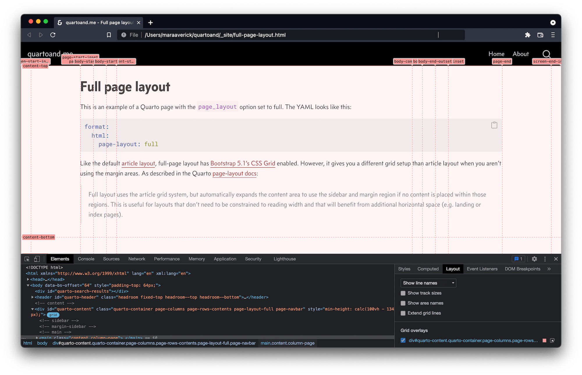
Chances are, you’ll be making use of Quarto’s built-in layouts (which I’ve put to use on this Quarto page-layout demo here). However, should you decide to define your own “tracks” (rows and columns), there’s an abundance of options and units. As with rems in typography, CSS-layout units have also evolved to accommodate a variety of devices more easily.
New to me was the flex fraction or fr unit, “which represents a fraction of the leftover space in the grid container” (Brufau et al. 2020). Flex fractions (frs) are particularly useful in consort with the CSS grid-template-* properties: grid-template-columns, and grid-template-rows. Mastery Games’ CSS Grid Track Options provides a helpful overview of the various units relevant to defining your grid layout.
Another neat feature is that you can name the lines of your grid when defining it with grid-template-rows and grid-template-columns. This is helpful as you can then reference these named lines when placing items in your grid using the grid-row- and grid-column- start and end properties.
Your browser’s built-in developer tools are a great way to learn more about CSS grid. If you inspect a page’s HTML, grid elements will have a little grid pill button next to them which you can click to toggle a grid overlay display. The Layout pane gives you more options, such as showing grid-line or area names, and has a listing of all of the grid overlays on the page.
For more details on viewing the grid with browser developer tools for Chrome (or Chromium-based browsers), check out Inspect CSS Grid (Yeen 2021). For Firefox, see CSS Grid Inspector: Examine grid layouts (MDN Contributors 2021a).
Learn like an a11y
If, like me, you’ve sort of stumbled into learning more about CSS, be sure to take the time to zoom back out and read up a bit on best practices, especially when it comes to accessibility. Quarto and Bootstrap are both built with accessibility in mind, but if you’re tweaking things on your own, there are some quick things worth checking for to ensure you haven’t borked said accessibility efforts. Writing CSS with Accessibility in Mind (Matuzović 2017a) isn’t the newest article on the matter, but I found it concise and helpful—plus, it gives you many more resources to explore.4 Also worth peeping Writing HTML with Accessibility in Mind while you’re in the neighborhood (Matuzović 2017b).
Since there was so much to learn from these resources, I’ve continued my notes in a second post, CSS Grid and accessibility.
References
Footnotes
I don’t even know enough about Babel to decide whether or not that joke works.↩︎
See CSS At-Rules for details.↩︎
The single-file themes are in the Quarto GitHub repo.↩︎
See also the more recent series by the same author, Writing Even More CSS with Accessibility in Mind (Matuzović 2020a, 2020b).↩︎
Reuse
Citation
@online{averick2022,
  author = {Averick, Mara},
  title = {Down the Front-End Rabbit Hole},
  date = {2022-01-01},
  url = {https://quartoand.me/front-end.html},
  langid = {en}
}